10 min to read
Statistics - Descriptive Statistics - Visualization
This article is a part of the Statistics - 101 series, you can access the full version of the series here:
-
Foundation
-
Descriptive Statistics
- Summarizing data
- Visualization (you are here!)
-
Inferential Statistics
-
- Probability and distribution
- Hypothesis testing
- Estimation
- Regression
Welcome to the third article of the Statistics 101 series. In the last article, you have learnt how to summarize data using numbers.
But “a picture is worth a thousand words”, right? Visualization is an integral part in a Data Scientist toolbox, not only because of its effect on human’s perspective (some people prefer graphs and charts to numbers), but it can also yield useful information that is hidden behind numerical figures.
After reading this article, you will learn:
- 1. Overview
- 2. Types of plots
- 3. Wrap up
1. Overview
1.1. Why do we even need visualization?
As mentioned before, visualization plays a very crucial part in every data project. To better understand its importance, refer to the example below:
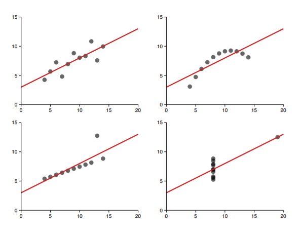
Can you guess what happened here? This is a famous exercise by Francis Anscombe (1973).
The graphs are illustrated by using 4 different datasets which all have identical linear statistics: mean, variance, correlation, even the regression line are identical. By looking at only numerical summary statistics to determine the true nature of the data can result in misleading result, which can be avoided if visualization is implemented.
For example, the top right dataset would be better represented by a polynomial regression function, not linear as described in the graph. Or the point at (20,13) in the bottom right corner can almost be surely classified as an outlier, and should be remove from the analysis.
Such information is not apparent without directly seeing what the data would be in graphs and charts. And that’s when data visualization comes in handy, it supplements the information we gathered from summary figures.
1.2. Types of visualization
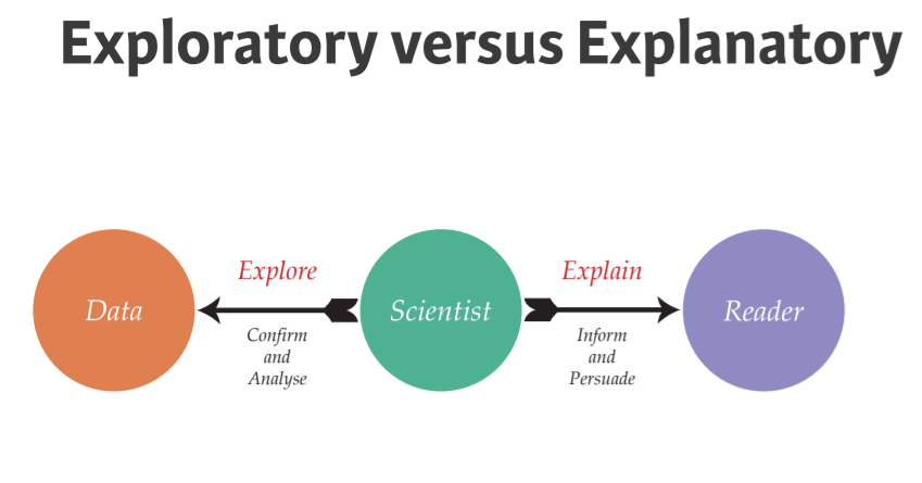
When you access the visualization universe, there are two types of visualization, each comes with very different target and process.
-
Explore:
- Target: Specific audience like yourself and your colleagues
- When to use: Start of the project, to understand more clearly the data you are working with
- Unique properties: Easily generated, data-heavy
-
Explanatory:
- Target: Broader audience
- When to use: Presenting the findings to others (BOD, decision-makers, etc.)
- Unique properties: Labor-intensive, data-specific
1.3. The grammar of visualization
Before we dive into different types of plot, first you need to equip yourself with the vocabulary in the visualization universe.
| Element | Description | Example |
|---|---|---|
| Data | The dataset being plotted | iris dataset |
| Aesthetics | The scale onto which we map our data | x, y |
| Geometries | The visual elements used for our data | points, lines, areas |
| Facets | Plotting small multiples | dividing into smaller plots on different flower types |
| Statistics | Representation of the data to aid understanding | linear regression line, confidence interval |
| Coordinates | The space on which the data will be plotted | zooming, flipping |
| Themes | All non-data ink | fonts, axis ticks |
2. Types of plots
2.1. Proportion
2.1.1. Pie chart
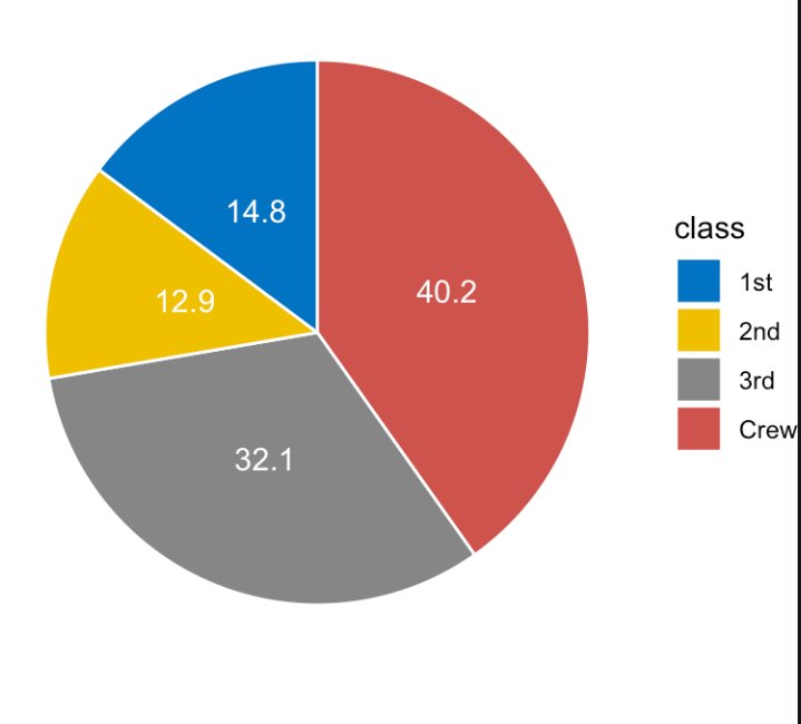
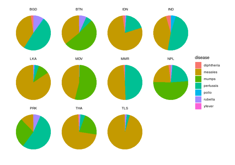
Advantage:
- Intuitive, easy to understand
- Popular to viewers
- Compact
Disadvantage:
- Always need to use together with text specifying the percent each part of the chart occupies.
- If there are too many classes and no text -> hard to compare even in the same chart because there is no anchoring point (illustrated in the right chart above)
- Not very precise because data is encoded in angles.
2.1.2. Waffle chart
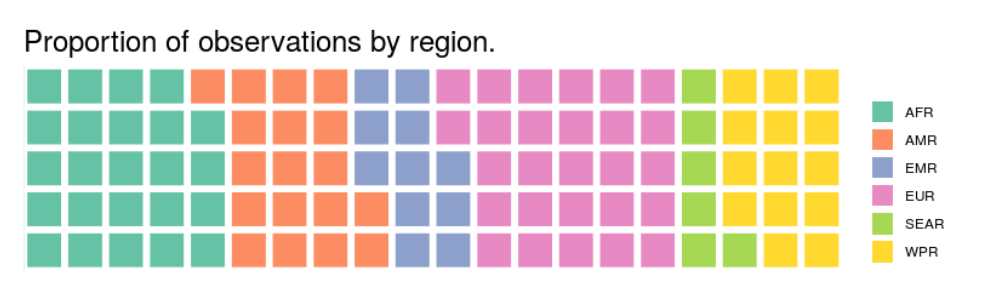
Taken into account these weakness of pie chart, waffle chart is born to tackle these. By dividing the space into 100 equal squares, each stands for 1%, you can easily compare the proportions of classes within one chart by counting how many squares a class occupies. However, comparing among several class is still a pain since the problem of no anchoring points still linger in this type of plot.
Advantage:
- Can handle a large (not too large) number of classes
Disadvantage:
- Not very compact
- Cannot compare because there is no anchoring point
2.1.3. Stacked bar
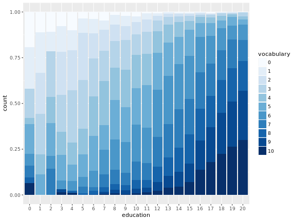
If pie and waffle chart both cannot resolve the problem of comparing multiple proportion, stacked bar is born with the view to achieve that goal.
By presenting each proportion as a single column and combine multiple columns together, stacked bar efficiently allow us to visually compare the value of a class among multiple proportion.
Advantage:
- Allow each population to share the same y-axis
Disadvantage:
- Lack of anchoring point for in-group comparison
- Worse in isolation
- Need to keep number of class small
2.2. Point
2.2.1. Bar chart
One of the most popular chart used to represent data point is bar chart. Bar chart is used when a categorical value is mapped to one of the axis
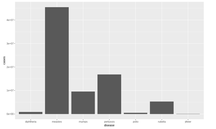
Advantage:
- Popular
- Simple
- Accurate
Disadvantage:
- Large number of classes would be a problem
- Take up lots of space
2.2.2. Point chart
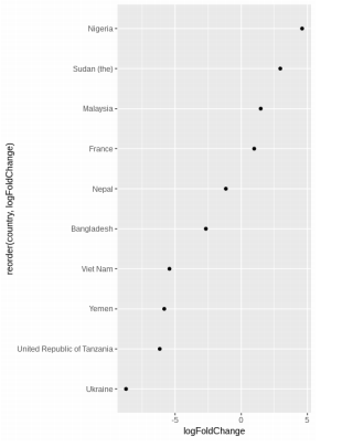
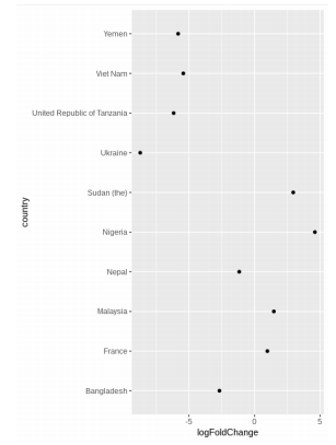
Point chart is an alternative to bar chart, fixing the problem of requiring large space. To increase the interpretability of the chart, the result should be sorted as in the above figure.
Advantage:
- High precision
- Efficient representation (require smaller space)
- Simple
Disadvantage:
- Nothing so far
2.3. Distribution
2.3.1. Histogram
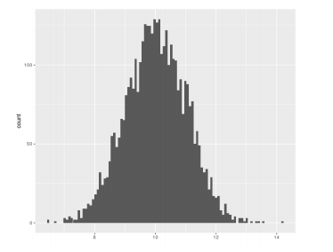
A histogram is an approximate representation of the distribution of numerical data.
To construct a histogram, the first step is to “bin” (or “bucket”) the range of values—that is, divide the entire range of values into a series of intervals—and then count how many values fall into each interval.
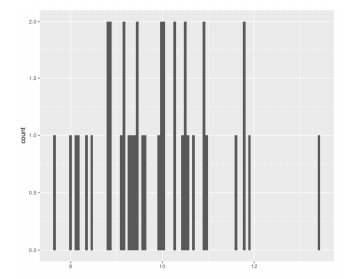
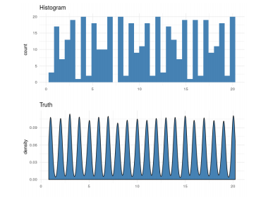
Choosing an appropriate numbers of bins in a histogram is a work that require great data sense and patience too. Too few bins can lead to a graph that looks like a bar code (as in the following chart), and too many would hide useful insights from the data.
Advantage:
- Useful for one distribution at a time
- Can use count/density
- Intuitive
- Interpretable
Disadvantage:
- Sensitive to bin placements
-
Iffy with small amounts of data (create data spike, as in the chart below)
2.3.2. Kernel Density Plot
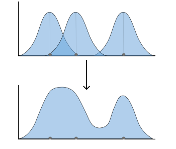
To avoid data spike as stated in the previous part, Kernel Density Plot (KDE) is usually adopted.
In KDE plot, each data point is considered as a normal distribution with equal binwidth, the overlapping part is then summed up to finalize the plot
Advantage:
- Can use with data with multiple strong peaks
- Can deal with small data
Disadvantage:
- Choosing binwidth would be a pain (like bin in histogram)
2.3.3. Kernel Density Plot together with rug plot
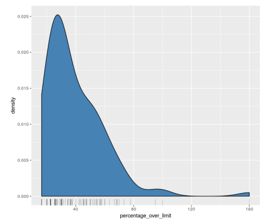
Using such method to smooth out the distribution of a numerical data, some insight could be hidden in KDE plot. As a best practice, use KDE plot together with rug plot to fully extract information from the dataset.
Rug plot is usually located under the KDE plot, each data point would be represented by a black line. The darker the area, the more data points are located in such area.
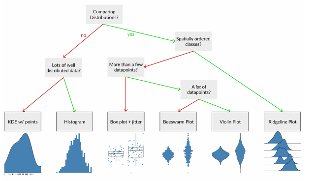
2.4. Comparing distribution
2.4.1. Boxplot
We know that we can use histogram or KDE plot to demonstrate a distribution, but such charts are not effective when being used to compare different distribution since they cannot be stacked together for comparison.
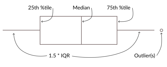
In such case, the most popular chart is boxplot, since it can contain a lot of information: where most of the data is located (median, 25% percentile, 75% percentile, whisker) and potential outliers. If you forgot about IQR, refer to the last article.
However, using boxplot alone can create a confusing result, since all the measures used (median, 25% percentile, 75% percentile) are constructed using only the relative position of such value in the dataset, which means that these measure do not take into account the actual value of other data points. As a result, two similar boxplot can have very different underlying data, as shown here:
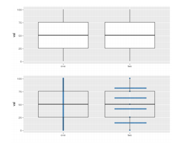
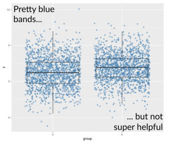
As a result, using boxplot, together with a scatterplot (jittered) would yield more information and a more accurate conclusion. However, there is a downside for this, which will be discussed in the next section.
Advantage:
- Can spot outlier
Disadvantage:
- Skew & bimodality can be tricky
- Too many data point can be tricky
2.4.2. Beeswarm
Using boxplot and scatterplot simultaneously is very useful, most of the cases. But there should there be a medium to large amount of data, it would create even more confusion.
That’s when plots like beeswarm and violin come in handy. While a box plot only shows summary statistics such as mean/median and interquartile ranges, the violin plot shows the full distribution of the data
Beeswarm plot is built on the basis of scatterplot and histogram. In beeswarm plot, every data point is shown, and packed next to each other. Individual point are clumped together as close to the axis as possible but not allowed to be overlapped (this is called smart jittering).
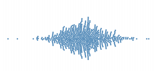
Advantage:
- Can be used with medium amount of observation
- Distributional shape
Disadvantage:
- Get hard with lots of data, because they are not allowed to be stacked
- Arbitrary stacking: which point get drawn first is a matter
2.4.3. Violin
Remember that beeswarm is somewhat the combination of scatterplot and histogram? And histogram has a problem that should be fixed by KDE plot?
The notion is the same for beeswarm plot and violin plot.
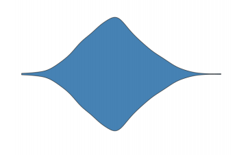
Advantage:
- KDE reflected
- Easy to compare (because of symmetry)
- Every datapoint is heard in a less arbitrary manner (since there are no stacking order biases)
- Can deal with a large amount of data
Disadvantage:
- Kernel width
- Not every datapoint is seen
- Can’t use rug (use point/boxplot instead)
2.4.4. Ridgeline
Ridgeline plot is a special plot used to compare distribution. It is specifically used for ordinal data. In Ridgeline plot, one ordered dimension is mapped onto one of the axis, which is useful for comparison.
Ridgeline plot adopted KDE, as a result, it bears pretty much every advantage and disadvantage of KDE plot.
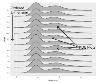
Advantage:
- Convey shifts in distribution over ordinal axes
Disadvantage:
- Smaller plots could be overlapped
- Hard to choose binwidth
3. Wrap up

Comments